Iconography

Overview
Iconography is an important part of any brand identity. It helps simplify complex ideas, aid comprehension, and add visual rhythm to a layout.
Characteristics
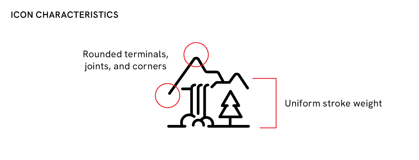
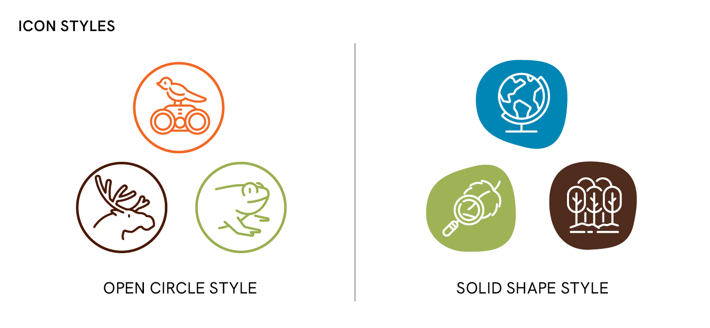
We created an iconography style that is line-based, drawn with uniform stroke weights, rounded terminals, and joints. This consistent open style gives our icons a soft, approachable look while remaining highly legible at small sizes—whether in print or on screen.
The defined line style also makes the system extendable—allowing new icons to be introduced as new areas of work and focus emerge.
Icon styles
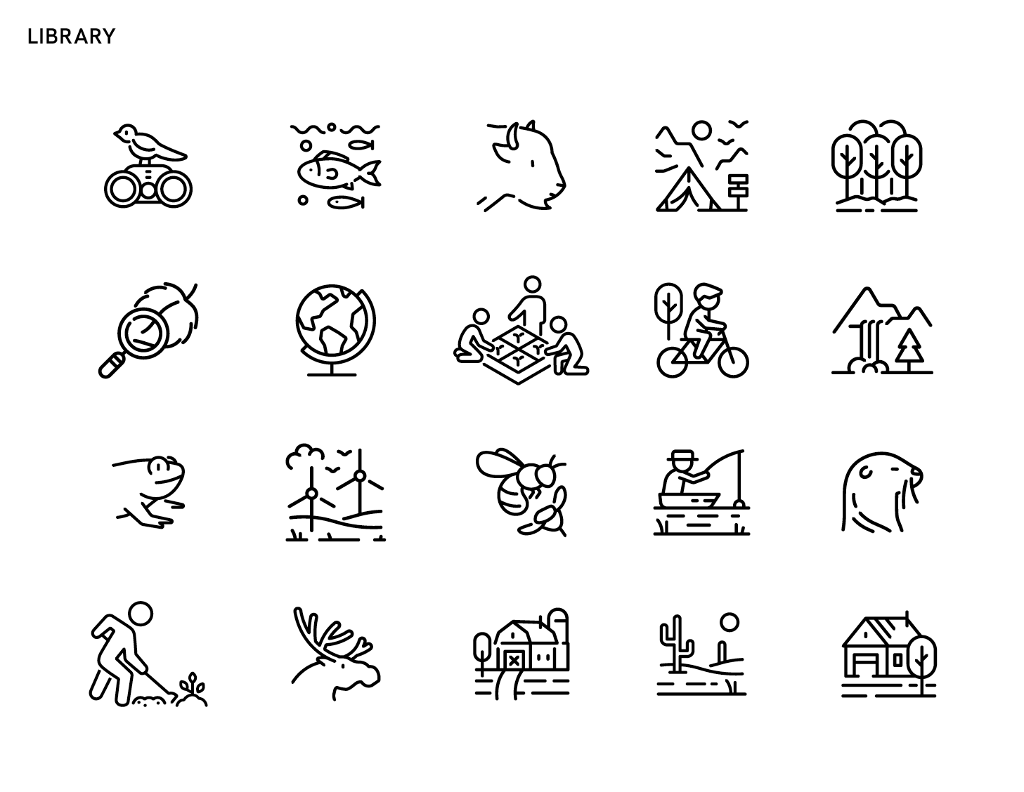
We have a wide variety of icons to choose from in our icon library. Please do not modify the icons or create your own icons without review and approval from the NWF brand team.
OPEN CIRCLE style
The open circle icons are consistent in stroke weight and size, creating a cohesive design. For added visual depth, the circles can be filled in white.


SOLID SHAPE style
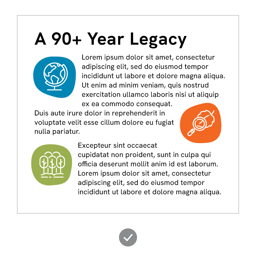
The solid shape icons are used in text to break up the copy block.
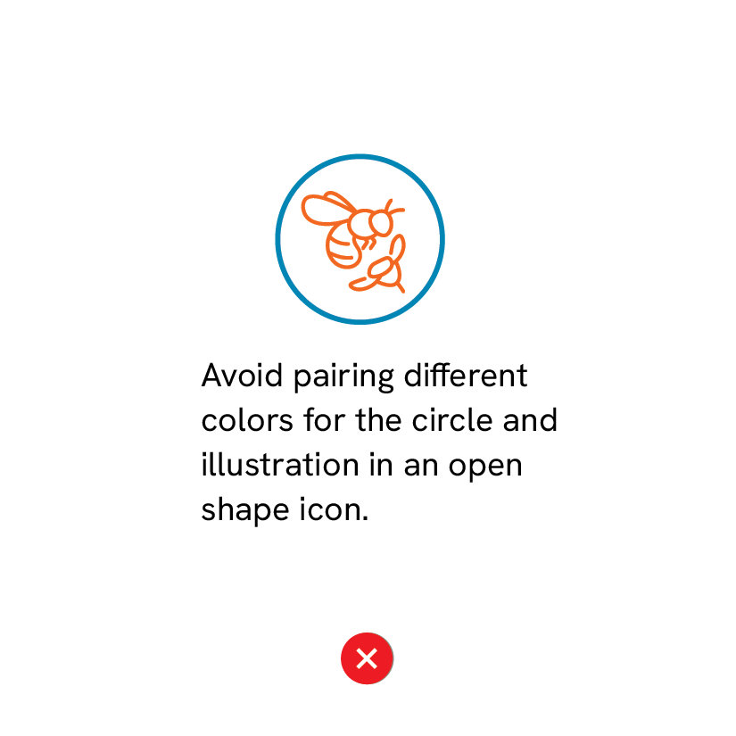
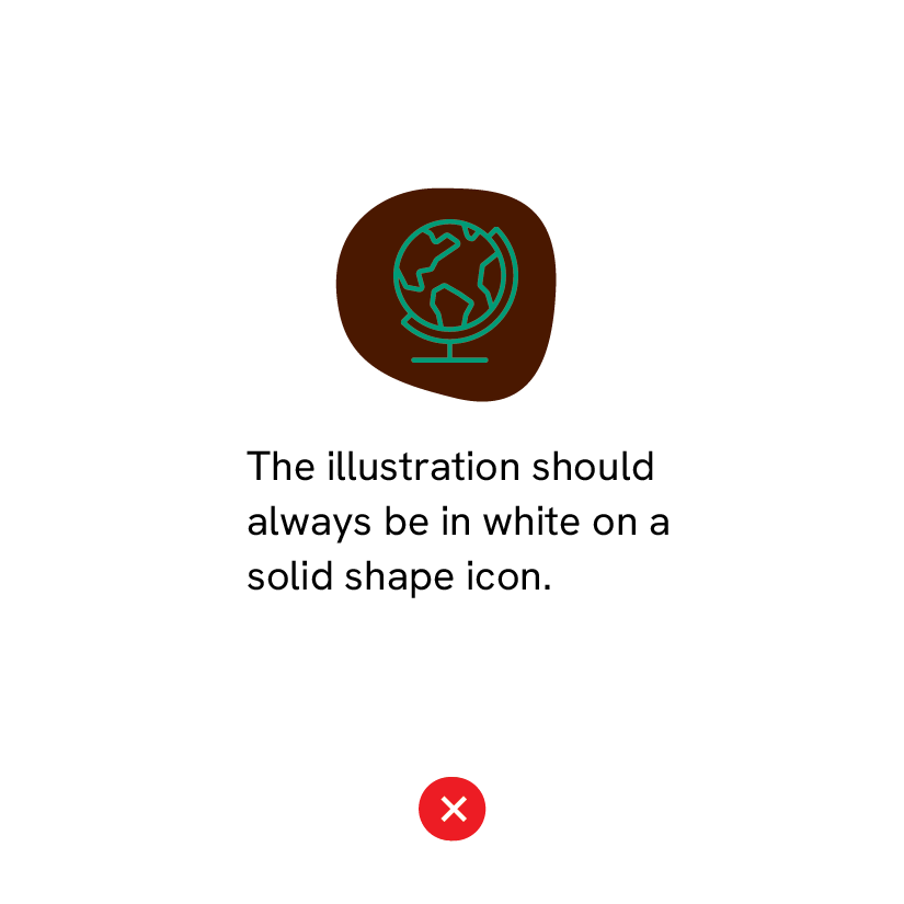
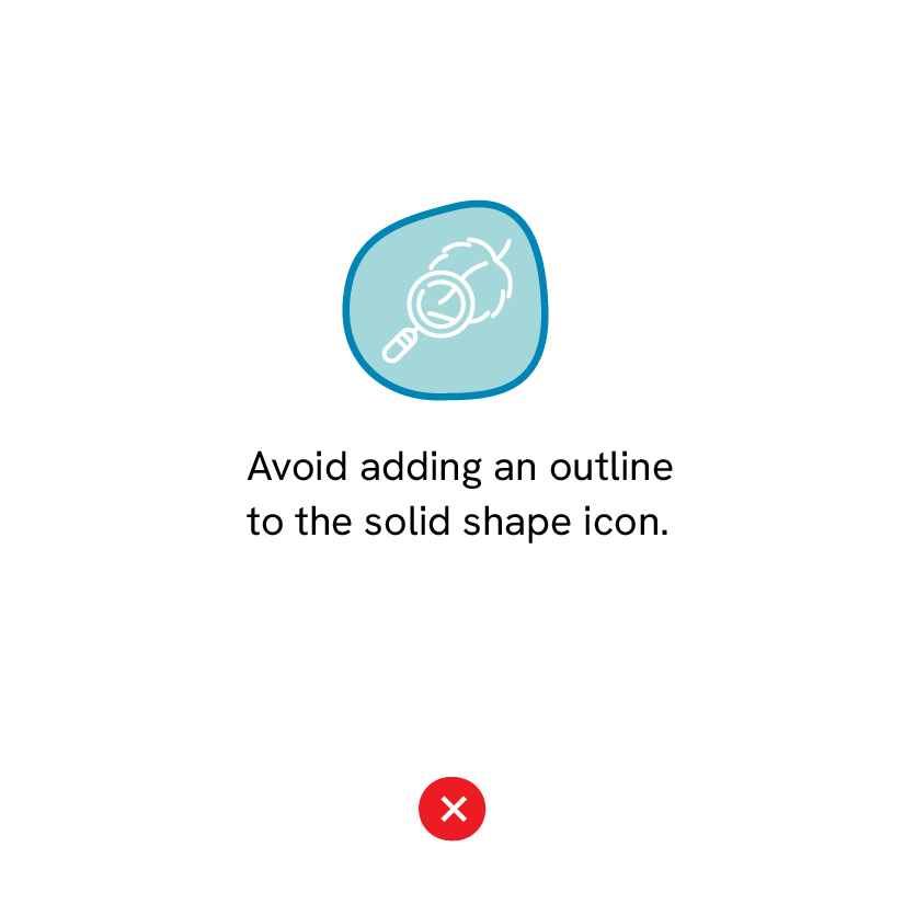
incorrect use
Keep icon styles consistent. Do not combine colors or create shapes that fall outside our brand guidelines.