Styles & Hierarchy

Overview
Our typography system includes two complementary pairing styles that create flexibility while maintaining a cohesive brand identity. Using both approaches helps keep typography engaging, adaptable, and expressive across different contexts.
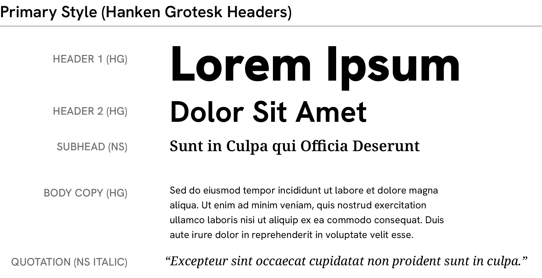
Primary Style
This style feels modern, rational, and direct. Hanken Grotesk leads with clarity and confidence, while Noto Serif adds warmth and humanity in supporting roles. Use this approach for communications that emphasize innovation, expertise, and impact.
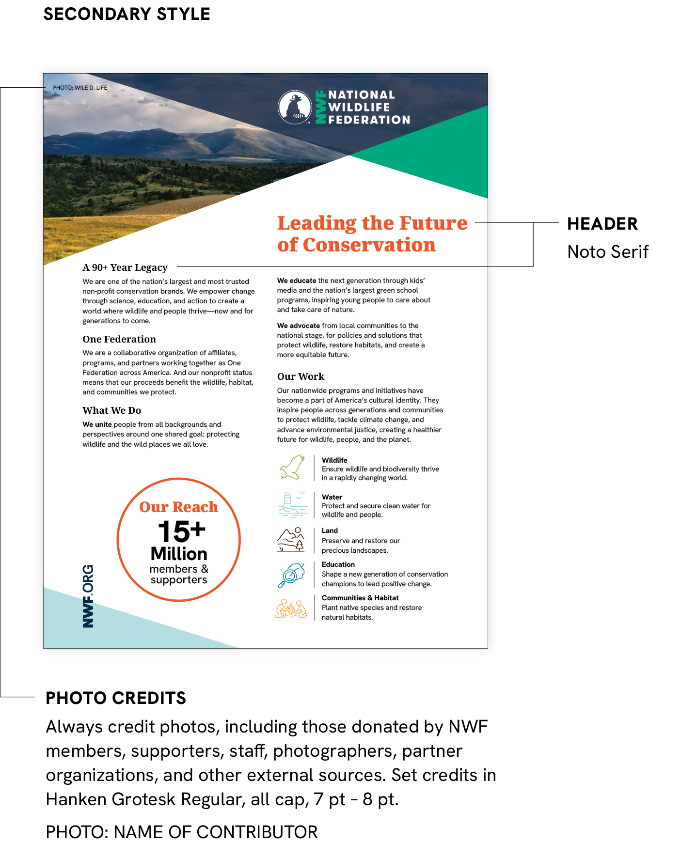
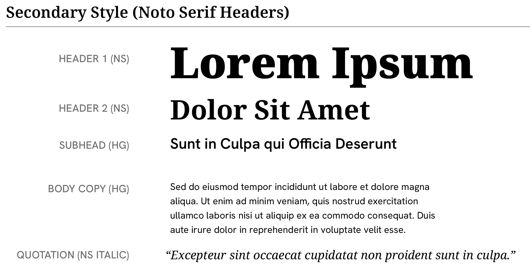
Secondary Style
This style feels softer, warmer, and more approachable. Noto Serif brings expression and personality to headlines, while Hanken Grotesk maintains structure and readability. Use this approach for community-focused messaging and more human-centered communications.
Examples