Color Harmony

Overview
Thoughtful color pairing helps create balanced, readable, and visually engaging designs. Pair darker grounding colors with lighter supporting colors to maintain contrast and allow key content to stand
out clearly.
PRIMARY COLOR PAIRING
Ocean Blue is the dominant brand color and should serve as the foundation for most color combinations. It pairs best with lighter colors from the palette to create clean, confident, and accessible designs.

Secondary COLOR PAIRING
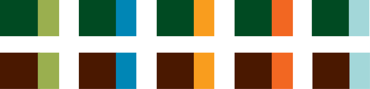
Forest Green and Redwood Bark can be used as secondary grounding colors when additional flexibility or tonal variety is needed. Pair these darker colors with lighter accent or neutral tones to maintain balance and readability.
What to Avoid
Avoid combining colors with similar tonal values or saturation. These pairings can compete for attention, reduce readability, or cause colors to visually vibrate against one another.