Proper Use
Please see the following correct and incorrect examples of logo and color placement to help avoid common design mistakes.
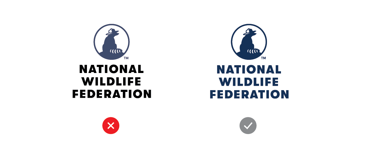
Proportion
Please do not squish or skew the logo in any way.

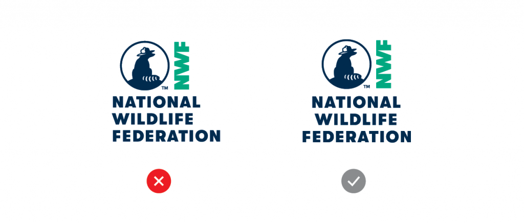
Elements
Do not alter the logo or any of the elements. Always use the official logo files to assure brand consistency.
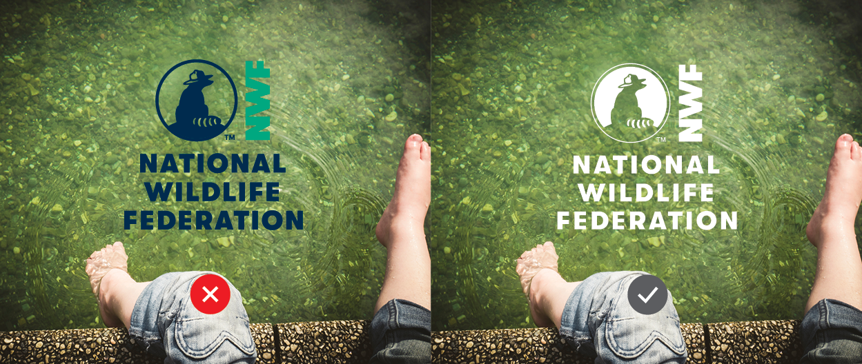
Readability
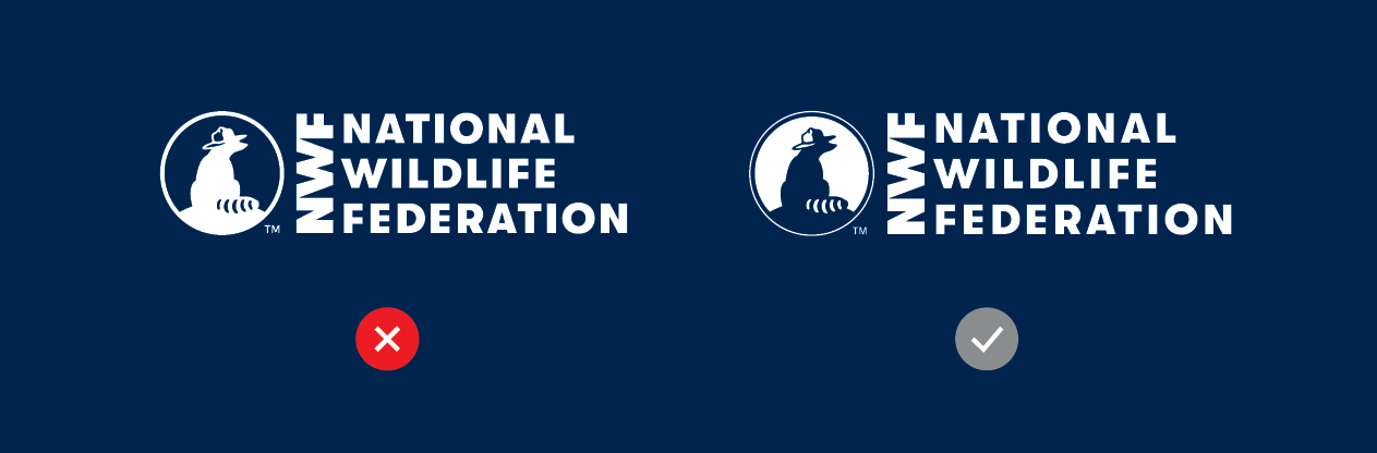
Make sure the logo has proper readability and contrast when used on a background.
Fonts
Don’t use substitute fonts for our logo.
ReverseD Logo
In our reversed logo, Ranger Rick’s silhouette in the icon remains dark against a white background.
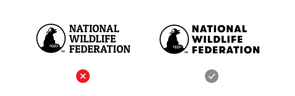
Secondary Logo ColorS
Our secondary logo is either 100% Ocean Blue or 100% Black. Don’t mix them up.