Patterns

Overview
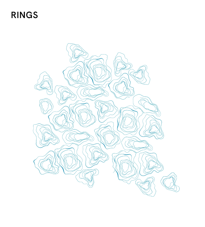
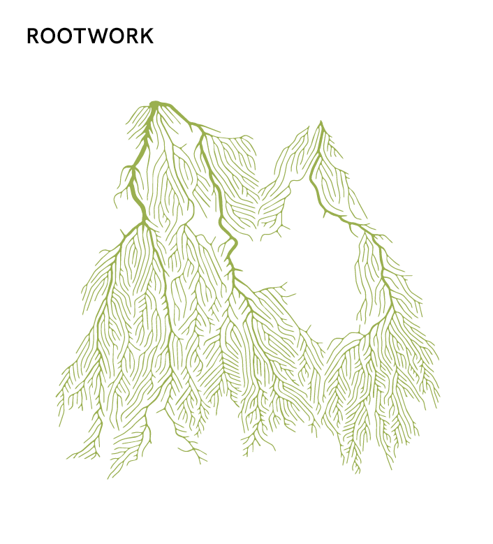
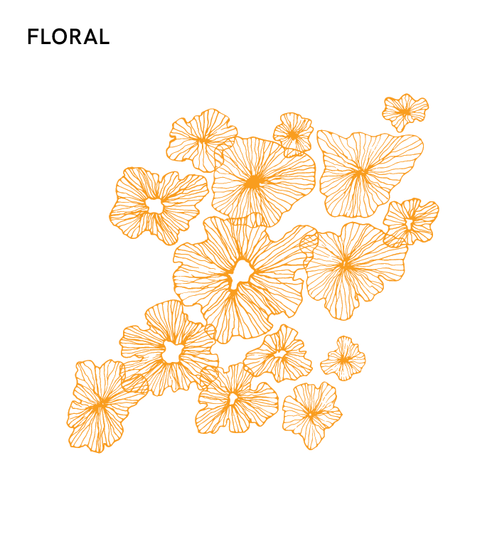
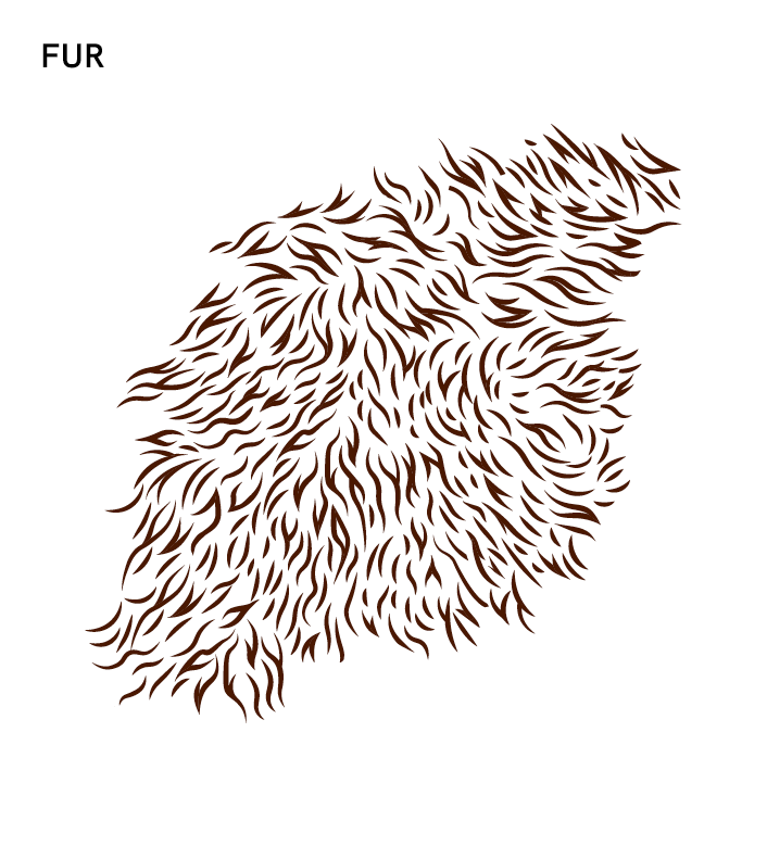
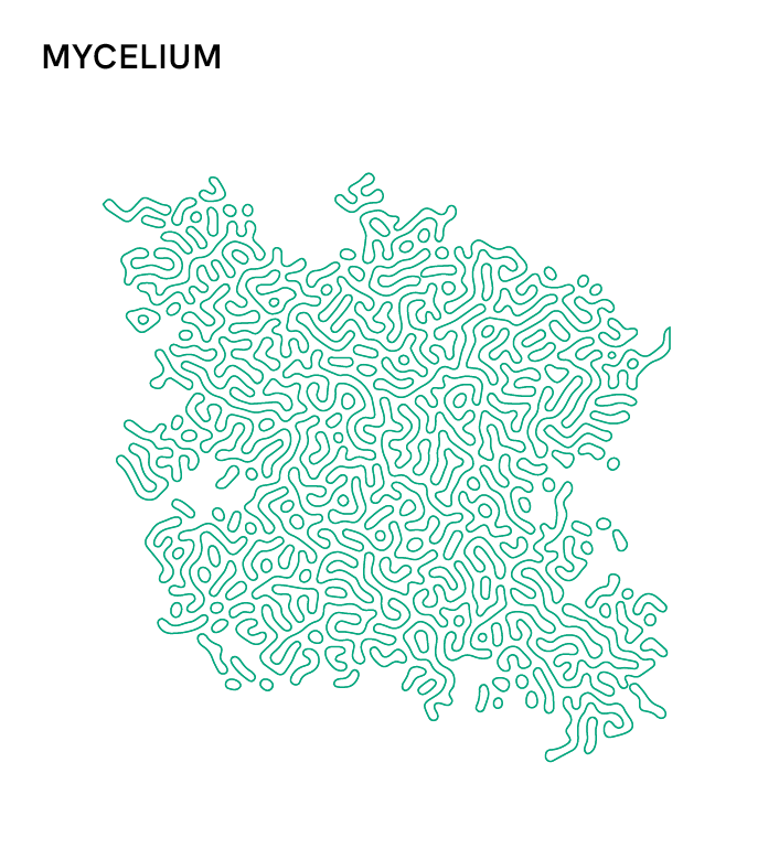
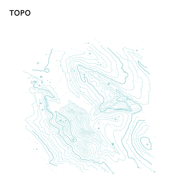
Our patterns are organic illustrations, not geometric repeating tiles, inspired by the intricate structures and textures found in the natural world. Used thoughtfully, they add depth, warmth, and texture to our brand identity without overpowering the message and content.
Usage
- Patterns may be used at a range of scales, from vignettes that bleed off an edge or a corner of a layout to a small shape of tight crops that reveal the details.
- Each pattern carries its own personality. Consider the messaging context when choosing a pattern: Floral for warmth and celebration, Topo for geographic vastness and places, Mycelium for growth and connection.
Color Application
- Each pattern is paired with a specific brand color. They should always appear as a single flat color on a background. Do not apply gradients, or recolor patterns without approval from the brand team.
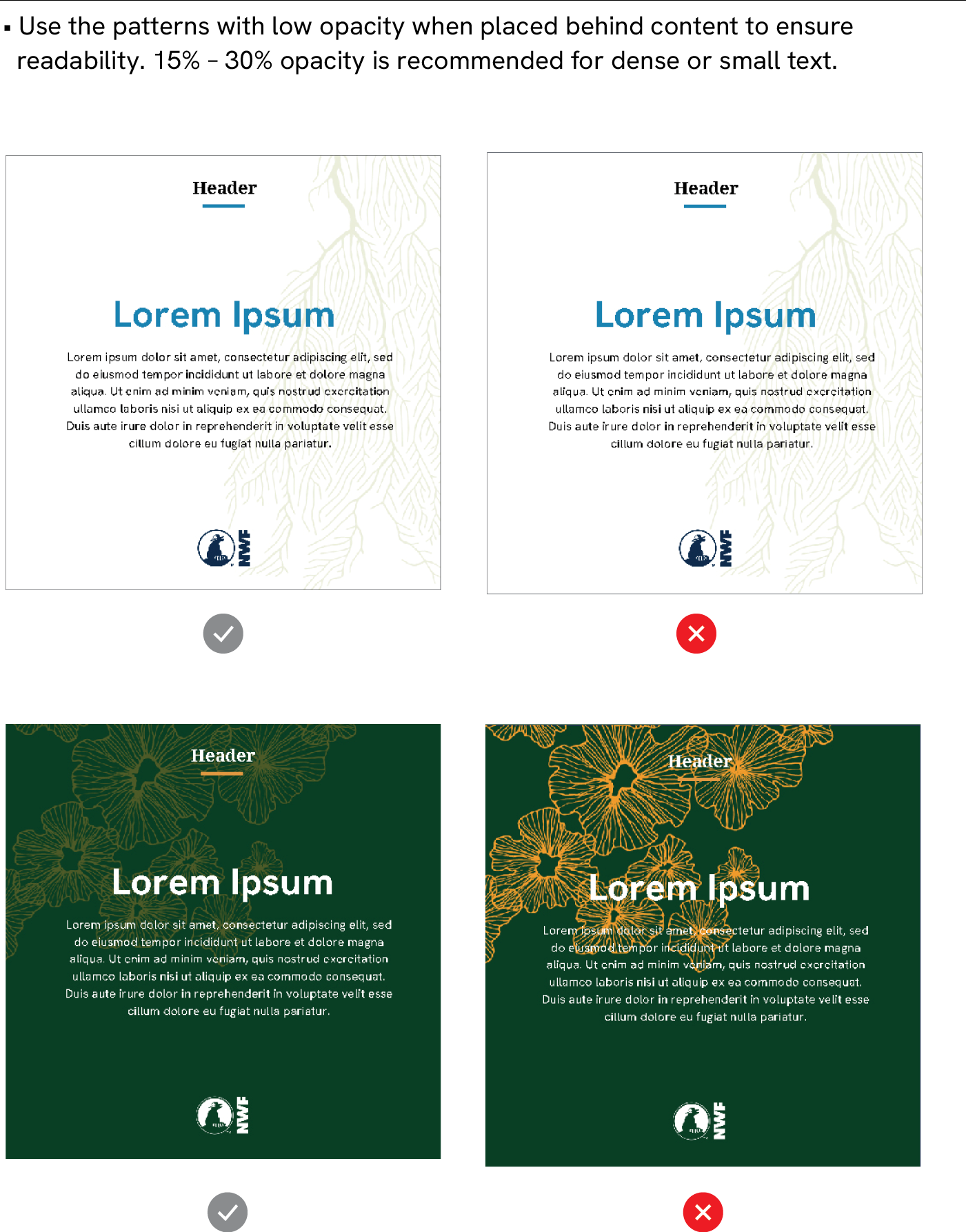
- Adjust the opacity of the patterns to complement the content and avoid compromising readability.
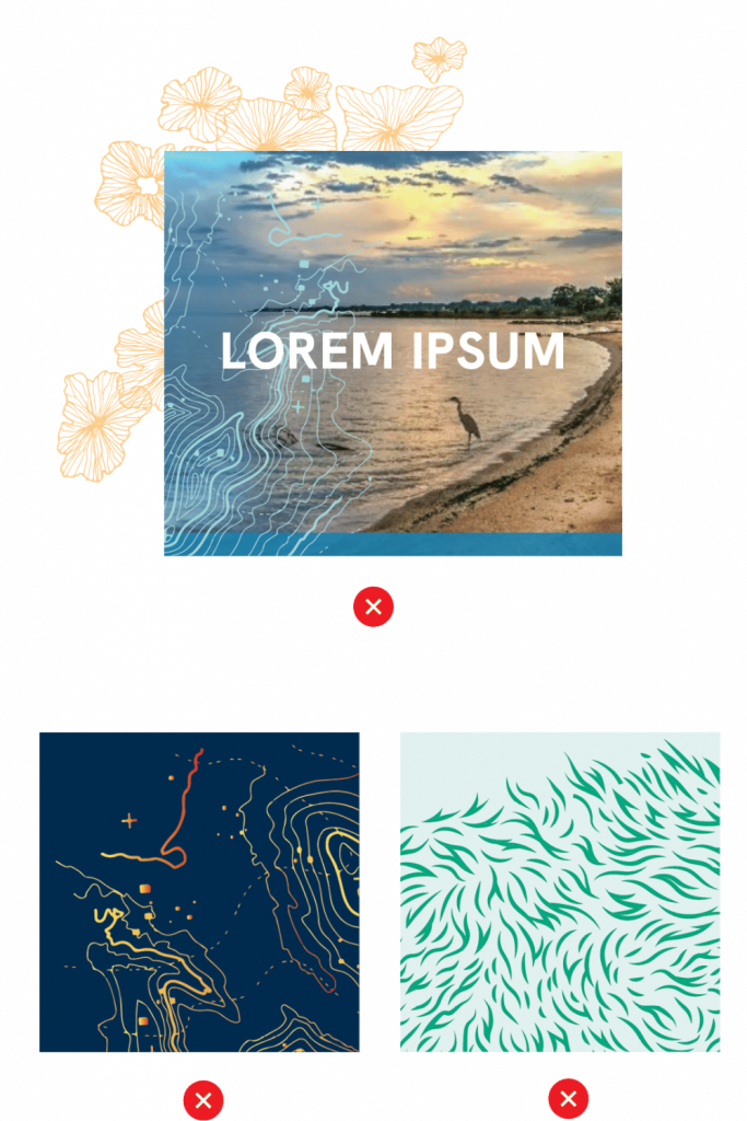
Proper Use
Please see the following correct and incorrect examples of pattern and icon applications to help guide their use in your designs.
Proper Use
Use the patterns with low opacity when placed behind content to ensure readability. 15% – 30% opacity is recommended for dense or small text.
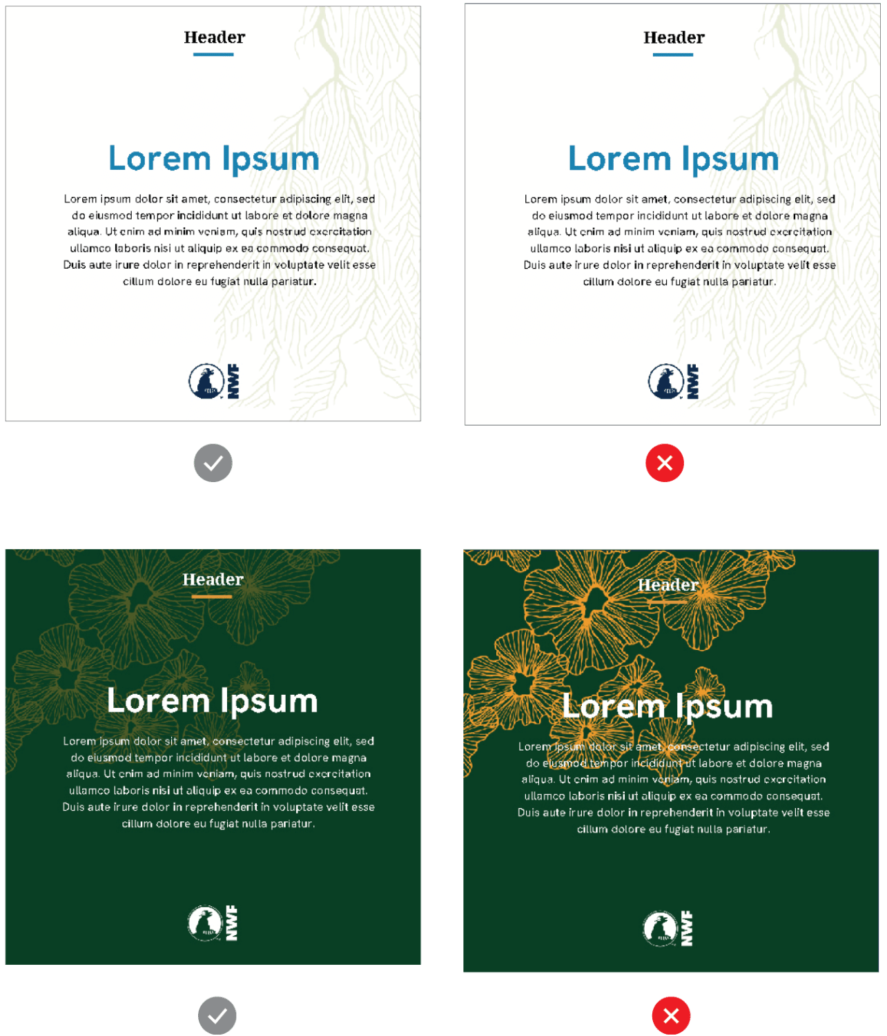
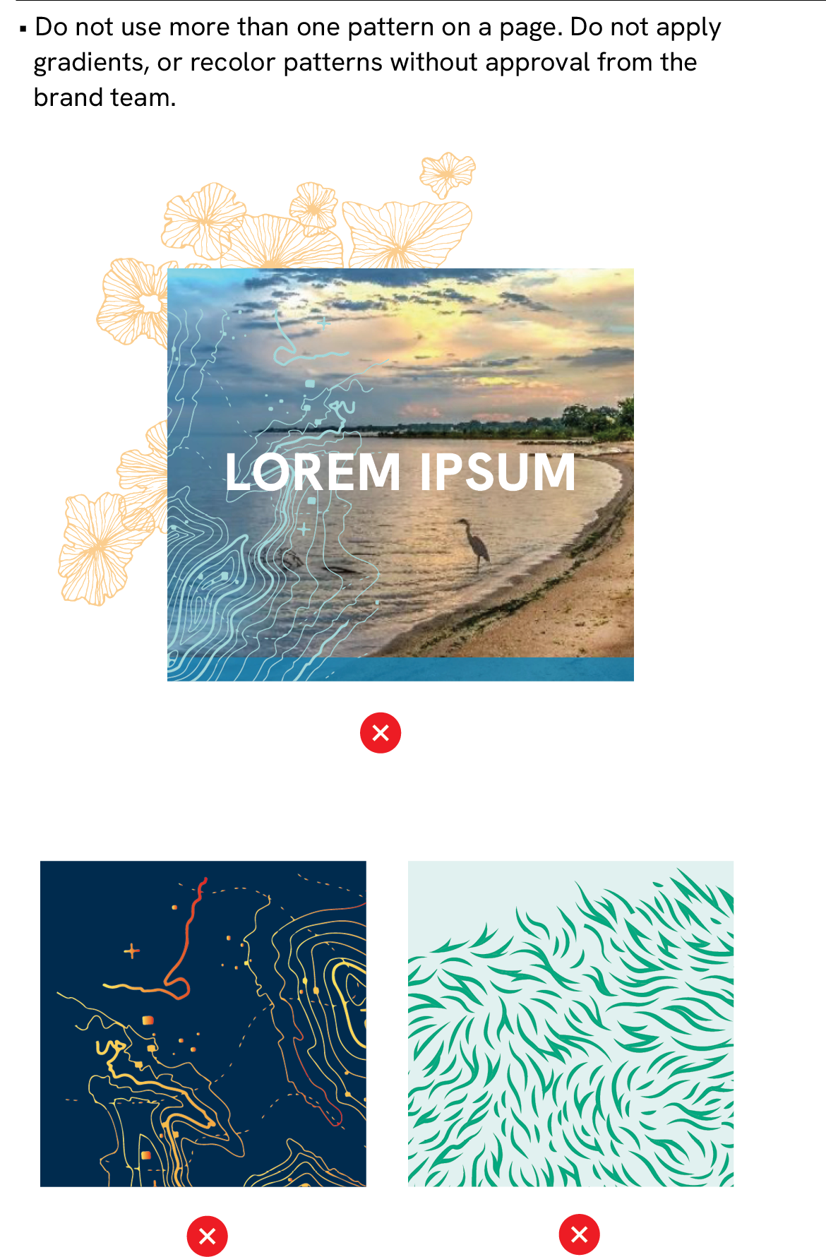
Do not use more than one pattern on a page. Do not apply gradients or recolor patterns without approval from the brand team.