Typesetting Tips

Please see the following correct and incorrect examples for typsetting tips.
Tracking
Do not set the letter spacing (tracking) too tight. Use normal spacing for best readability.

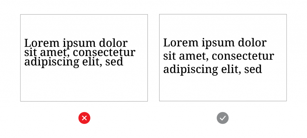
Leading
Do not set the line spacing (leading) too tight. Use normal or relaxed leading to improve readability, especially for large quantities of text.
Alignment
Do not use justified text. Without fine tuning, this can create odd spacing in paragraphs. Use left-aligned text.

Letter Case: hanken Grotesk
All caps in Hanken Grotesk work best for short subheads and callouts. Avoid using all caps for sentences or longer text, as readers can scan mixed-case text more easily.
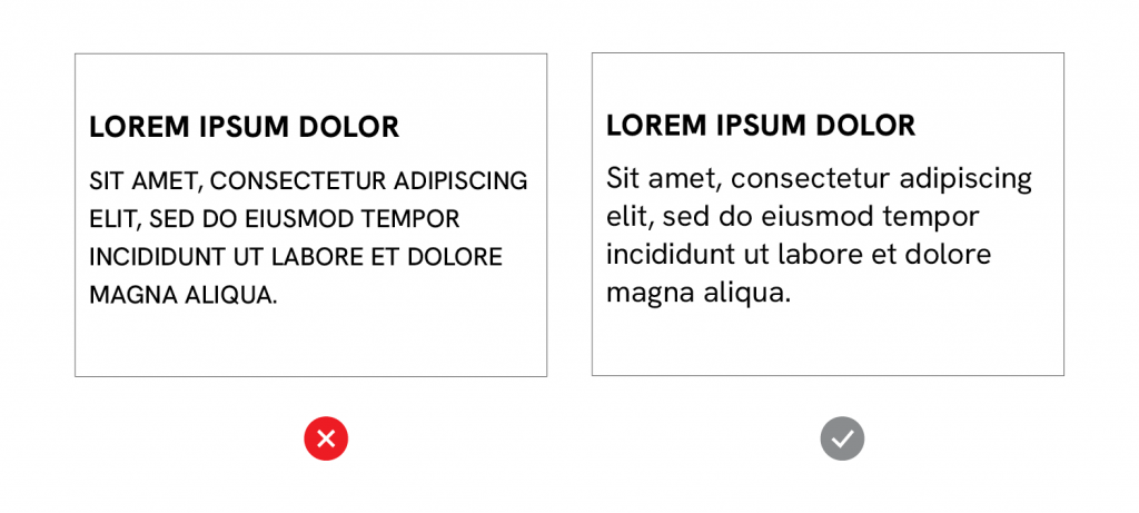
Letter Case: Noto serif
Avoid using Noto Serif in all caps. The lower-case letters are especially warm and approachable. Sentence case is preferred whenever possible.
